
Deutsche Welle - ECO
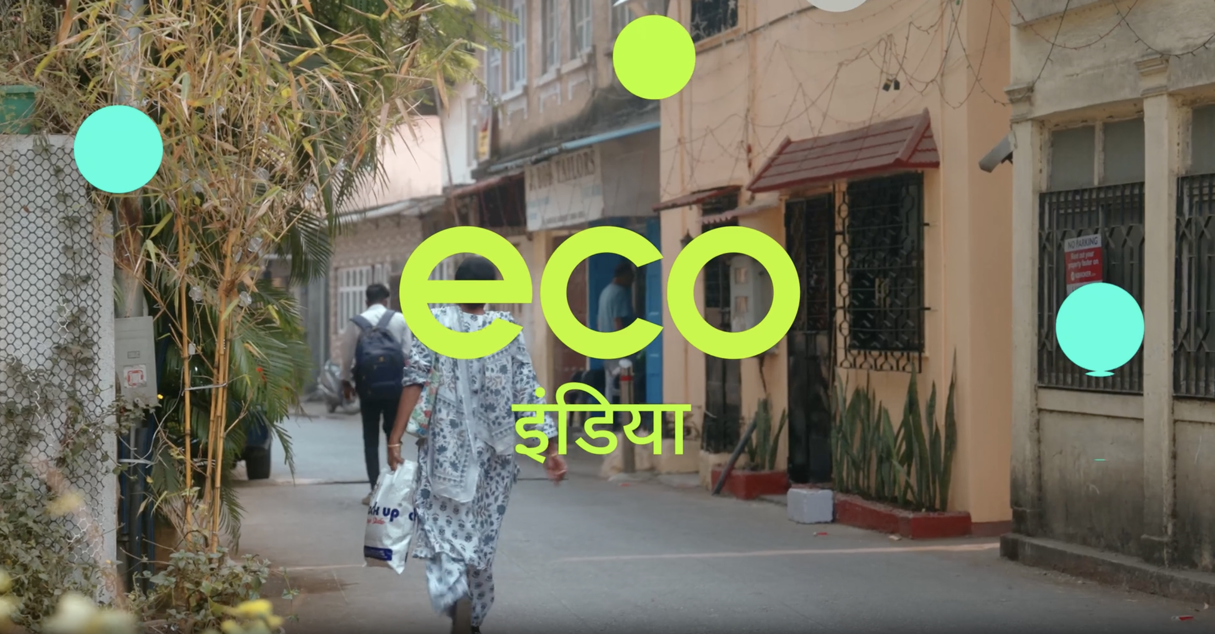
Local focus
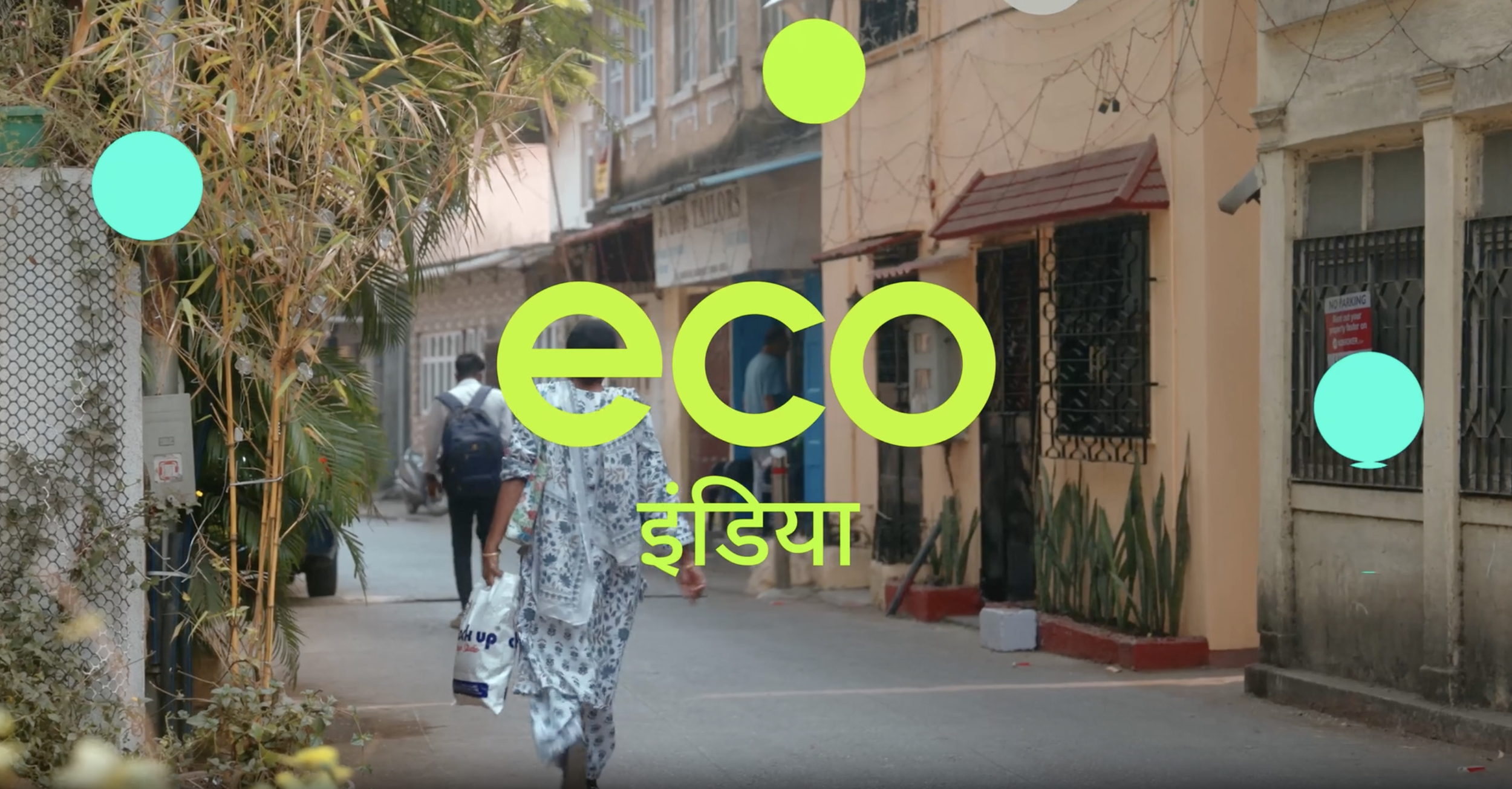
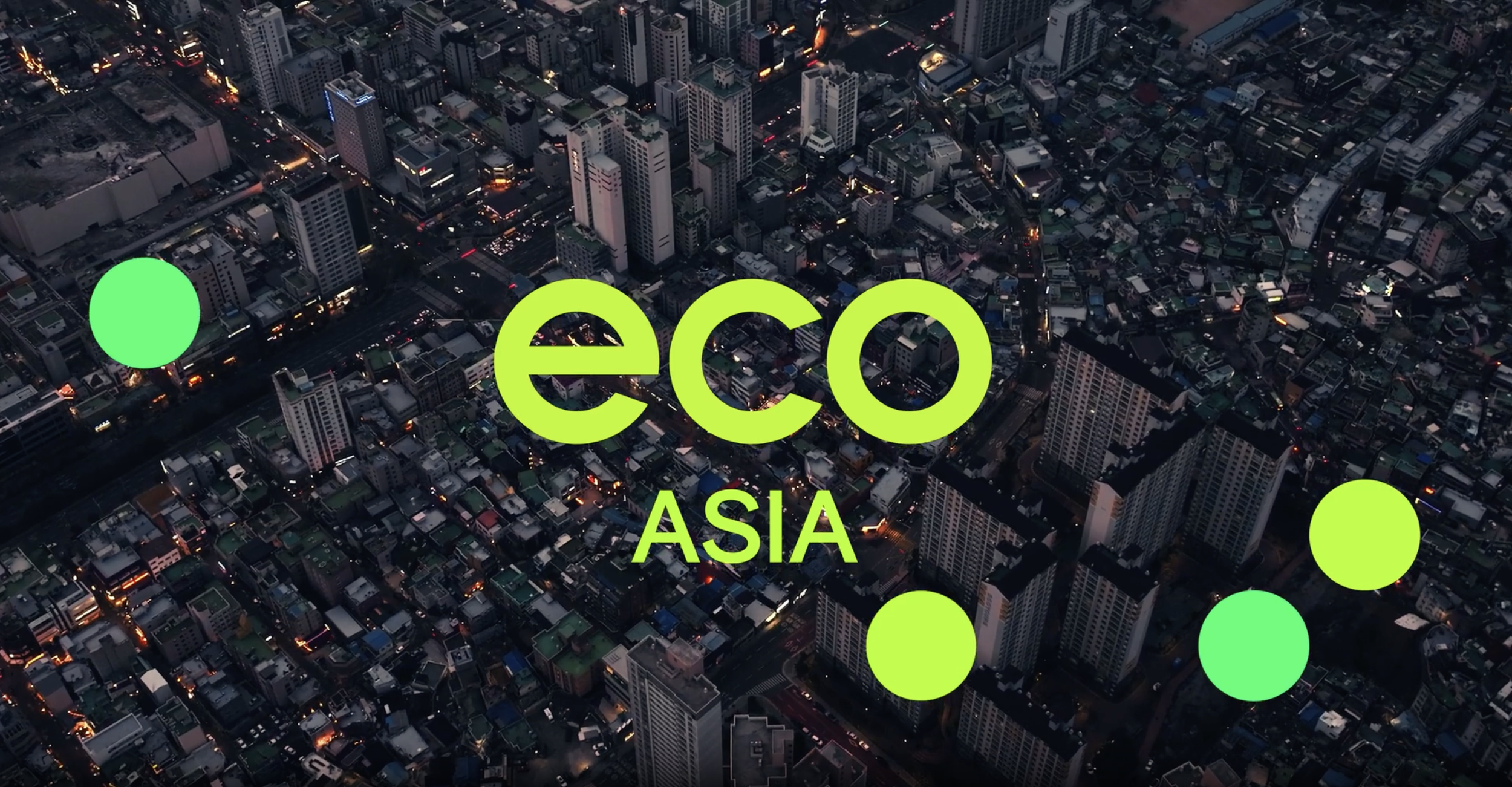
Cape Rock was asked to refresh the branding for Deutsche Welle’s hyper-local mission.
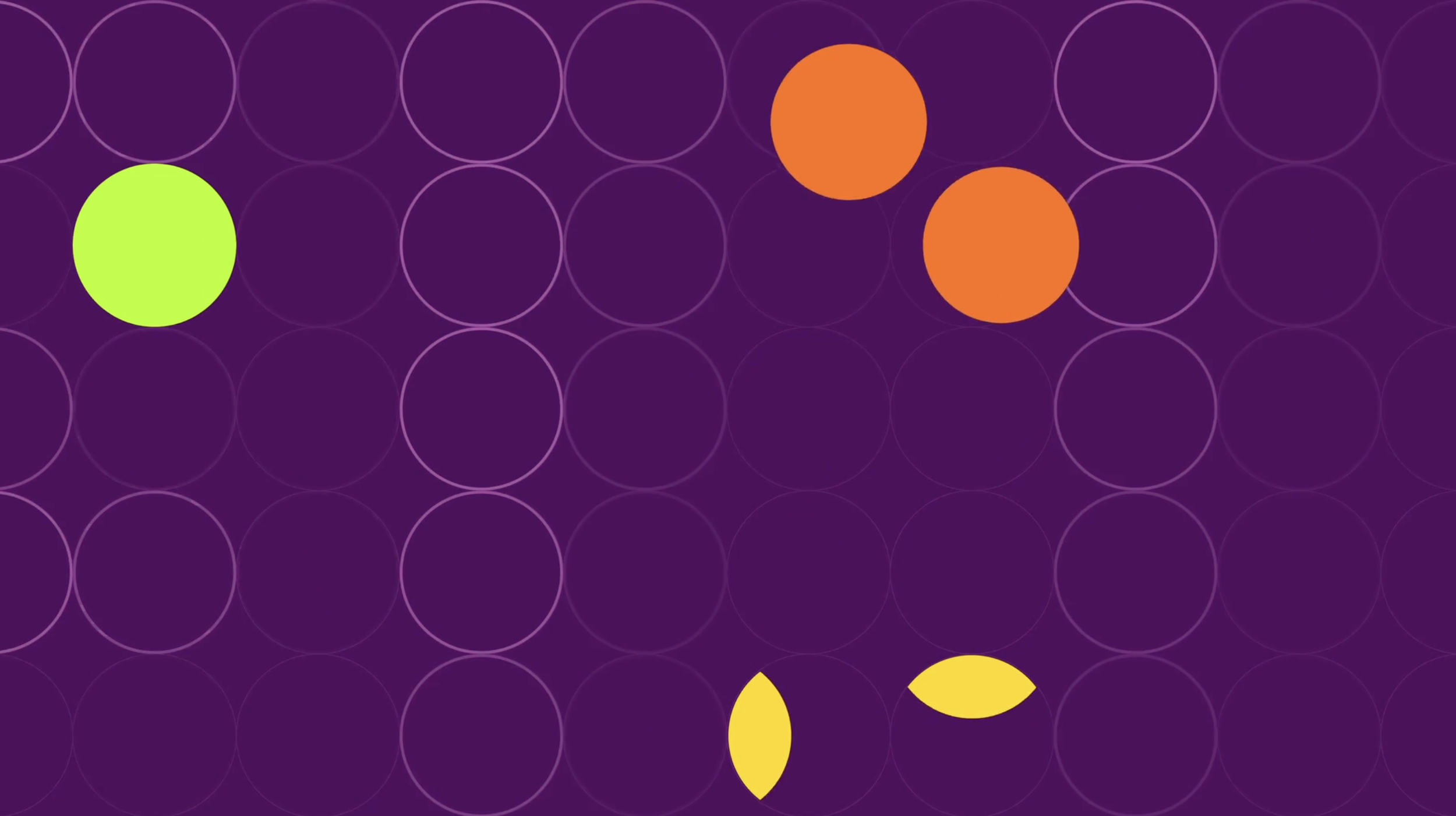
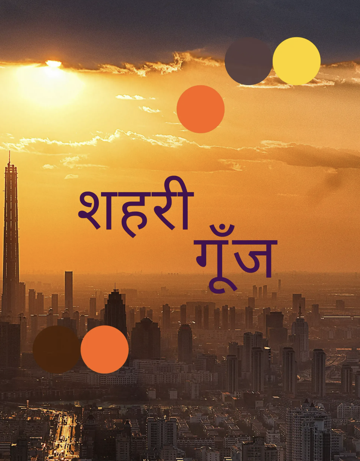
The update included an urban-inspired design, a vibrant colour palette, and a flexible grid inspired by an interconnected world. The typography combines DW Pangea for Latin and Urdu with Noto Sans for all other languages, keeping the system clear, consistent, and easy to read across regions.
Great to see the local focus come together with a strong international visual identity.
Client: Deutsche Welle
Agency: Cape Rock
Creative Direction: Dann Smit
Audio: Audio Militia
Motion Producer: Yuri Linthout